Ration tips by Goldilocks

Covid19, aka the coronavirus, has all of us scrambling to stock our pantries and medicine cabinets with items to take us well into the coming weeks at worst or months at best.

But even the most-prepared among us can use a tip or two on how to stretch those items.

Here are 9 ration tips that do just that:

Stretch a buck. Peanut butter and bread yield numerous calorie-dense meals.

Travel case. Leftover travel-size hand sanitizer, hotel soaps, fever reducer and facial tissue can get you out of a bind.

First Aid kit. Most are filled with bandages, ointments and gauze. Tailor the kit to suit your household needs by adding disinfecting wipes, fever reducer and other essentials.

Strategize. Part A = Save hand sanitizer, disinfecting wipes and masks for when encountering the public.

Strategize. Part B = Use other household products for everyday cleaning.

Citrus trees. Share your oranges or seek out those who have orange trees to help prevent scurvy.

Eat perishable foods first. But stock up on fruits and vegetables when available to stay healthy.

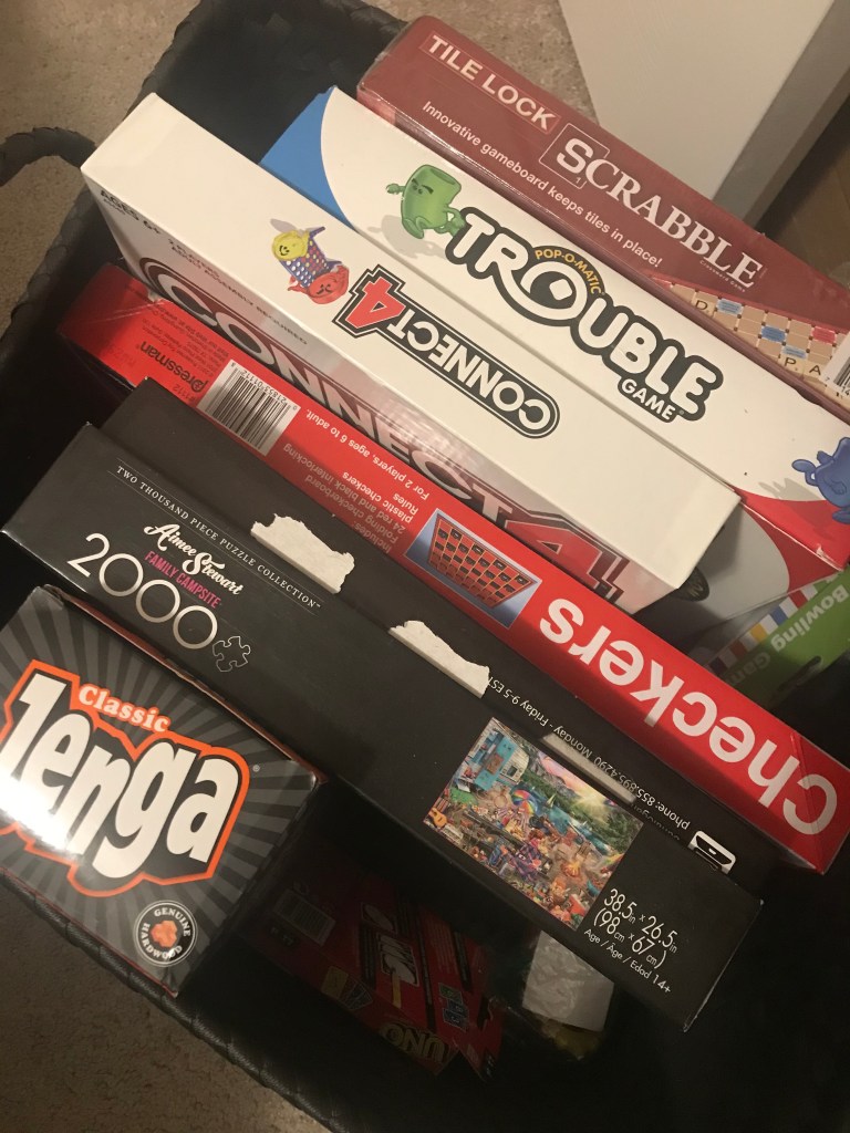
Games, puzzles, cards. Eat only when you’re hungry. Occupy your time with Jenga, Scrabble or Solitaire.

Conserve bottled water. Replace your refrigerator water filter regularly and save bottled water for emergencies.

Eat only when you’re hungry. Occupy your time by playing games or putting a puzzle together. Photo by Cindy Hernandez

The home bar

The home bar has made a comeback, and no one could be happier about that than John and me.

Rewind 23 months.

The builder of our house referred to the room just off the foyer as the study.

In the model, the room was decorated as a game room.

But as soon as we saw the space, John and I had two words: Home. Bar.

It wasn’t long after the purchase agreement was signed that John and I took to the stores in search of the perfect home bar. We saw a few pricier pieces. Mid-century modern pieces, to be exact, that would complement the Hollywood Regency style I had planned for the adjoining living room.

But the mid-century modern bars were just not John’s cup of (Long Island Iced) tea. So we searched. And searched. And searched some more.

I don’t remember why we ended up at American Furniture Warehouse, but there we were one Saturday afternoon. And there it was… the perfect home bar… in John’s opinion. A Guinness bar, to be exact.

Yes, a Guinness bar like one you would find in a public house. The pieces were sold separately, but we bought the collection: the bar, the mirror and four stools. Just like that, my vision of a Palm Springs-style home bar turned into an Irish pub.

But I have to admit, I loved the bar. The pieces were of good quality and everything matched. All we had to do was pray the collection would still be around in 13 months when the house was ready.

And it was. We snatched a set one month before we closed on the home. The bar was delivered the same day our washer, dryer and refrigerator were delivered. In fact, it was delivered a day before my bed was delivered. Priorities.

The bar room is a work in progress. We still need to hang a Guinness sign, hang some art and find a table lamp. But the mirror is hung and the bar and stools are situated just so.

The bar room has truly become one of our favorite spaces in the house. And that is where you will find us very Friday for happy hour.

Cheers. Or in this case, Erin go Bragh.

The room off the foyer is perfect for the home bar. Photo by Cindy Hernandez
The bar room has become John and my favorite space in the house. And that is where you’ll find us very Friday for happy hour. Photo by Cindy Hernandez

Artwork placement mistakes to avoid

One of the most common design mistakes I see is artwork that is too small for the space.

I once heard a photographer say when you have the shot just right, take one giant step toward your subject. NOW it is just right.

The same can be said about artwork. Just when you think you have the right size, go bigger. Even if it’s just a tad larger.

This might mean you have to go with a different piece. Or you have to shop around for a similar subject in the right size. It sometimes means you have to shop for the size, and then settle on the subject.

But trust me, it will make all the difference on your walls.

Artwork is supposed to stand out.

Artwork is supposed to make an impact. A statement.

It’s supposed to garner attention. Provoke thought. Stimulate conversation.

It can be a drawing, a painting, a family photo. Whatever.

Lord knows you paid a lot of it, so make it count. Fill the space as much as possible. There is nothing worse than having the blank space on the wall dwarf the piece of art you thought worthy of adorning your home.

If your artwork is small and you’re determined to use the piece, hang a collection of small pieces to create a larger display. If you do this, though, go with three pieces. Yes, three. Or five. Just as long as it’s an odd number.

The other mistake I see is placement that is too high on the wall. Your visitors should not feel like they are peering up at the Empire State Building. Artwork should be at eye-level. Who’s eye-level? I recommend the person in the house of average height.

Instead of extending your arms upward as you place the art against the wall, extend your arms outward. Not up and out. Just straight out.

Test this out. See if it works. If the size of your art was right from the start, you may just have a natural eye for this stuff.

This canvas of mason jars is perfectly placed at eye-level. Photo by Cindy Hernandez
Avoid the temptation to place artwork higher on the wall in order to fill the space. Instead, always shoot for eye-level. Photo by Cindy Hernandez

Toothbrush holder-turned-vase

I love taking an item intended for one purpose and using it for another.

Case in point. Bathroom accessories.

The toothbrush holder to be exact. Who really uses the toothbrush holder?

I mean, I understand the purpose and I get its handy function. But do we really want our toothbrushes on display? I think not.

But that doesn’t mean I won’t buy the toothbrush holder if it is part of a collection.

Take the downstairs bathroom, for instance.

I bought the toothbrush holder that came in the white and chrome hotel collection, but instead of using it to hold toothbrushes, I use it as a vase. I place a single stem of something or other in the center hole and leave the other two holes empty.

In October, I displayed a single maple leaf.

For Christmas, a sprig of holly.

In March, some clover.

For Easter… well, you get the idea.

This allows me to purchase the items in a collection so that all of the pieces match, but without being so predictable in how I use them.

Give it a try. Or better yet, tell me how you’ve recreated an item’s purpose.

Turn the toothbrush holder into a vase by placing a single-stemmed floral or greenery in the holes. Photo by Cindy Hernandez

Put your money where it matters

My house is one of the few on the block that doesn’t have white shaker cabinetry.

Not that I have anything against the trend. It’s clean. Simple. Feminine. But I wanted a finish that would stand the test of time.

The last time I chose cabinetry was in the mid-1990s. White-washed cabinets were the trend. I loved it. And as soon as I had the chance to decorate a kitchen, I picked it. But as soon as I did, I felt that white-washed cabinets were on the way out.

That’s how I think of white cabinetry. Beautiful today. But who knows tomorrow? Already we see blue and green cabinets taking over the design world of kitchens, laundry rooms and baths.

So when it came time to selecting the cabinetry for this house, John and I went with standard maple in a sable-colored finish. The cabinetry complements a man AND a woman.

It sways toward the masculine but not as much as, say, the espresso finish.

It says a man lives here but so does a woman.

It evokes Mother Nature but dresses up well. It’s neutral and serves as the perfect backdrop to any style.

The other factor was cost. We didn’t even ask how much an upgraded cabinetry would set us back. Instead, John and I put the money toward 42-inch uppers with a 3-inch crown molding.

And from what we could tell from peeking into the other houses during construction, molding and cabinet size made the kitchen more than the color of the cabinet. I think we chose well.

Tall upper cabinets with an impressive crown molding make the kitchen more than the color of the cabinetry. Photo by Cindy Hernandez

To adorn or not to adorn?

The wall space between the pantry door and the closet door doesn’t have to be decorated. You can go either way, and have the same effect.

Some notice the artwork I hung there. Others don’t.

I may not have even thought to adorn the space had it not been adorned in the model.

If I recall correctly, the model had only one piece of artwork – impressionist fruit if memory serves me right.

I knew I wanted three art pieces in vertical formation. Green. Leaves. Not the same leaf, but leaves in the same style. And I found exactly what I was looking for in a 3-pack set.

But I have to admit, after the pieces were hung, I wasn’t blown away. Maybe they had to grow on me? (Vegetation humor.) But a few months have passed, and they still don’t blow me away. And I’m not sure why.

Is there too much space between each piece? But any closer, and I was afraid they would look squished.

Everyone who’s seen the pieces says they look fine. And I believe them. But I still can’t put my finger on why I’m not completely convinced.

I wish I had a shot of the wall without them so that I could get your input.

Thoughts?

As I’ve thought about it more, I might know what it is, but I want to get some feedback first. So have at it. Please.

After these pieces were hung, I wasn’t blown away. Maybe they had to grow on me? (Vegetation humor.) Photo by Cindy Hernandez

Llama

John and I loved the llama canvas the moment we saw it.

So presidential. So unexpected. So perfect for the wall above the toilet in the downstairs bathroom.

It would be a couple of weeks still before the house would be ready. But the store had only two left, so we grabbed one.

The canvas is black and white, which were the colors I wanted for that bathroom. The space is not small by any means. But because this would be the commode that company would use, I wanted the space to exude clean and simple.

I finished the look with white and chrome accessories for that hotel vibe, hung white and grey monogrammed towels, and — voila! – the first room in the house was complete.

Now when company is over, John and I hope they have to use the restroom just so we can hear them laugh.

A llama canvas, monogrammed towels and white & chrome accessories complete the downstairs bathroom. Photo by Cindy Hernandez

Because she fits just right

I joke to my friends that my house picked me.

I wasn’t looking to buy a house – by myself or with John.

But five months prior, John had suffered three strokes. He wanted to get out of his three-story condo that included a spiral staircase he now found precarious.

John’s condo was under contract. He was only weeks away from closing escrow.

It was early 2018. John wanted a single-level house that he could navigate easily. He lived alone. He was making strides in physical therapy, but he also had outgrown condo living, even before the stroke.

I had my own condo in the next town over.

Then one sunny afternoon, John and I happened upon a hidden community that was just a stone’s throw from his current neighborhood. The houses were larger than he needed and more than he wanted to spend, but it didn’t hurt to look, right?

As soon as we opened the door to the bright yellow model home, there was no turning back.

The house had everything John and I wished our own condos had. The floorpan was compatible with our lifestyle. The square footage allowed John and me to have our own spaces, and with common areas that would bring us together, too.

A week later, John signed the purchase agreement for a house of our own and I got the ball rolling on selling my condo.

Follow me on this journey of designing, decorating and adorning the home I named Goldilocks for her striking yellow-gold exterior… and because she fit just right.

Pardon the mess. Photo by Cindy Hernandez, April 27, 2019.