My design blog is for you

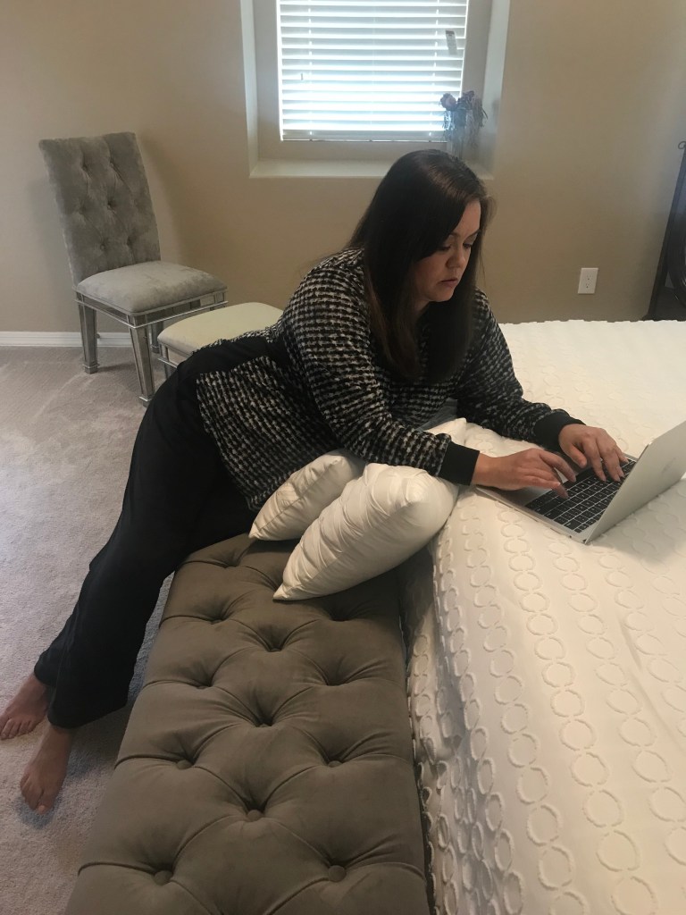
Are you a Mom with no juice left at the end of the busy day to create a soothing space for yourself?

This blog’s for you.

Are you a career woman who doesn’t want to spend the weekend making more decisions, especially on trivial matters like flowers and succulents?

This blog’s for you.

Are you just design inept?

This blog’s for you. And for anyone you know who may have said yes to any of these questions.

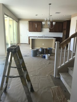
I get it. Decorating your house is stressful. It’s time consuming. There are so many choices, and you don’t know where to begin.

Wallpaper or paint? And if paint, what color paint? And what about the finishes? Flat. Satin. Gloss. High-Gloss.

The decisions are seemingly endless. The process is so tedious, it can make you want to throw in the towel. But are they monogrammed towels? And what about thread count? And I haven’t even mentioned the cost.

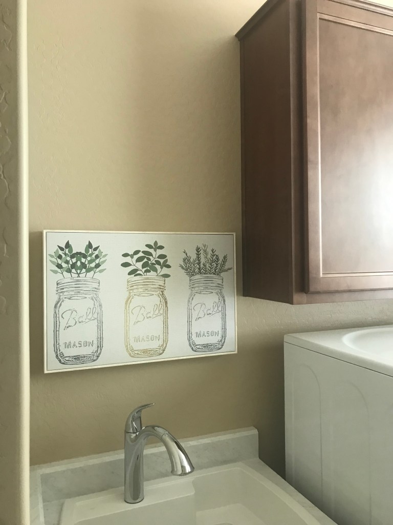
I’ve had no formal interior design training. Nor have I worked in the design world. But I’ve owned homes, new and used, and know a thing or two about picking out furniture, settling on colors, choosing artwork, and organizing spaces.

And I have done all of this on a budget. Because I believe interior design and home decor do not have to be expensive to make your home pretty and comfortable.

Don’t get me wrong. If you want to spend one-grand on a club chair, be my guest. My house holds a few pricier items, too. But only because I wanted to spend that kind of money, not because I thought I had to spend that kind of money.

On my blog, you will learn the reasoning behind the design choices I’ve made for my home that you can replicate in yours. I share budget friendly decor options and explain why I splurged on pieces to round out a look.

If the posts don’t address the design challenges you’re facing, reach out to me on my contact page or leave a question in the comments section. You might find your dilemma is the topic of my next design post.

My blog is for the busy, exhausted or uninspired, so send me a design question. Photo by John Hooks

Budget friendly decor

A lot of Americans are struggling financially in this pandemic.

Some Americans are doing okay, but are holding back on buying non-essential items.

Others are frugal, pandemic or not.

The argument could be made that home decor falls into the category of non-essential items.

While I would agree with that, I also believe that home decor doesn’t have to be expensive, pandemic or not.

For those who cannot make such purchases right now, I get it.

I too have been unemployed, or employed but financially strapped. But I never stopped dreaming about how I would decorate my personal spaces once circumstances improved.

If this blog serves as inspiration for your home, that makes me happy. Because the purpose of the blog is not to spend money you don’t have, but to use new or existing items to create calm, functional and happy spaces for you and your family.

Many of the items you will find in my house I have had for years. It’s true that I have splurged on some of the decor. But for the most part, the purchases I have made lately complement any budget.

Below are some examples.

This Project 62 landscape wall art from Target was under $15. Photos by Cindy Hernandez

This wooden accent lamp was under $10. It’s also from Target.

This accent plant was about $5. And yes, it’s from Target too.

Putting metals to the mettle

Every home decor has a metal.

Gold. Silver. Nickel. Brass. Antique brass.

Some decors have a combination of metals. I used to think you had to be either/or. That was, until I started designing Goldilocks.

Because John and I wanted yellow for the exterior color, we kept with the warm color palette and chose brown for the interior walls. This made it easy to go with the standard sable-colored cabinetry. And when I think of yellow and brown, I think of gold metals.

But I had a growing collection of silver and grey furniture at my condo that I wasn’t about to part with. Plus, the kitchen appliances and vent hood were going to be stainless steel and the chandelier over the dining table, silver.

What to do?

How was I going to mix the cool effects of grey and silver with the warmth that exudes from yellow and brown?

Enter the monochromatic artwork we found for the dining room walls. The art pieces include gold, silver, grey, cream and black and help transition the warm color scheme in the kitchen into the cool color scheme in the adjoining living room.

I realize now that it would have been okay to mix the metals without the monochromatic pieces. But the artwork gave me the permission I felt I needed at the time to cross the color palette lines.

What metal is your house? Have you ever thought of metals in this way?

These monochromatic art pieces help mix the warm browns and cool greys throughout the main floor. Photo by Cindy Hernandez

Artwork placement mistakes to avoid

One of the most common design mistakes I see is artwork that is too small for the space.

I once heard a photographer say when you have the shot just right, take one giant step toward your subject. NOW it is just right.

The same can be said about artwork. Just when you think you have the right size, go bigger. Even if it’s just a tad larger.

This might mean you have to go with a different piece. Or you have to shop around for a similar subject in the right size. It sometimes means you have to shop for the size, and then settle on the subject.

But trust me, it will make all the difference on your walls.

Artwork is supposed to stand out.

Artwork is supposed to make an impact. A statement.

It’s supposed to garner attention. Provoke thought. Stimulate conversation.

It can be a drawing, a painting, a family photo. Whatever.

Lord knows you paid a lot of it, so make it count. Fill the space as much as possible. There is nothing worse than having the blank space on the wall dwarf the piece of art you thought worthy of adorning your home.

If your artwork is small and you’re determined to use the piece, hang a collection of small pieces to create a larger display. If you do this, though, go with three pieces. Yes, three. Or five. Just as long as it’s an odd number.

The other mistake I see is placement that is too high on the wall. Your visitors should not feel like they are peering up at the Empire State Building. Artwork should be at eye-level. Who’s eye-level? I recommend the person in the house of average height.

Instead of extending your arms upward as you place the art against the wall, extend your arms outward. Not up and out. Just straight out.

Test this out. See if it works. If the size of your art was right from the start, you may just have a natural eye for this stuff.

This canvas of mason jars is perfectly placed at eye-level. Photo by Cindy Hernandez
Avoid the temptation to place artwork higher on the wall in order to fill the space. Instead, always shoot for eye-level. Photo by Cindy Hernandez