How I picked an area rug

I did it.

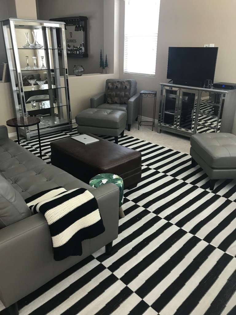
I bought an area rug for the living room.

I went with a black and white striped rug to match the monochromatic theme running through the room.

If you recall, I was torn about which style and color to go with. (See “How do you pick an area rug?” May 28.)

I wanted a rug with a pattern and some color, but not so busy that it would draw the eye downward. I had always liked the black and white stripes, but had reservations about going with that pattern, thinking it would be too bland with all of the other black, white and grey in the space. But I decided to go with it after all.

The more I shopped for rugs online, the more overwhelmed I got. And the more rugs I saw, the more I started to change the vision I had for the room. When I noticed myself doing this, I would go back to the black and white striped rug I liked from the start.

Then I would close the laptop and think it over.

Do I want to go contemporary? Or do I want to stay with the Hollywood Regency style that’s underway?

Should I chase a new look or stick with the glitz and glam I started with?

What is my design plan for the space in the years to come? And what about the adjoining rooms? What do I envision for the dining room, kitchen, bar room and entryway?

Every time I answered these questions, I came back to the black and white striped SoHo rug from Rugs.com.

The other factor was that the rug came in 10-feet x 13-feet, the size I needed in order to extend far enough on both sides of the sofa to cover the traffic areas.

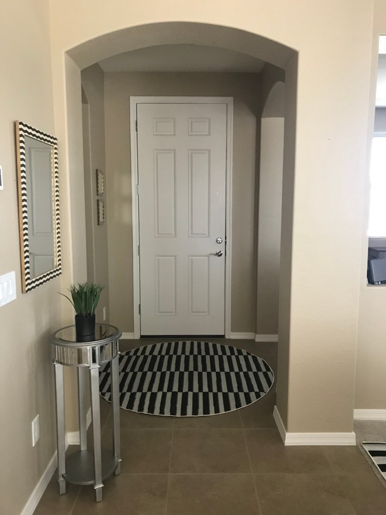
The rug also came in round options, which I absolutely loved. So for the entryway, I bought a matching round 5-foot x 5-foot rug to tie the two spaces together.

You rarely see round rugs. And even though the entryway is square-shaped, the round rug is unexpected and cuts the straight lines within the pattern.

The final deciding factor was some online advice that I received about choosing a rug. I was told to look at photos of rooms I want to re-create in my own home and then choose a rug that was used in those spaces.

Of course. That makes perfect sense.

And each time I researched Hollywood Regency spaces, I saw a lot of black and white in patterns that make a statement. And that’s exactly what I have in my new rugs.

The stripes did jump around after we rolled out the living room rug, almost playing tricks on our eyes. But after we moved the furniture back into place, the stripes became neutralized.

And because the living room is its own defined space, the rug does not impact the adjoining bar room, dining room and kitchen, allowing me to go in a different direction in those areas if I want to.

In the end, the black and white striped rug was the best choice.

So what is a design trifecta?

I’ll attempt to answer this question by asking another question:

When it comes to decorating your home, what do you want your furnishings to accomplish?

Let me break it down a little further.

If you need a new couch for your loft, what do you want that couch to do? Do you want it to provide seating? That would be function.

Do you want the couch to look pretty? That would be style.

Do you want a couch that you can relax on all weekend, melt into, maybe even take a nap on? That would be comfort.

Often times, furniture does one or two of these things. But when it does all three, well, that’s the design trifecta.

I’m a firm believer that furniture and home decor can encompass all three elements. It just takes a little more work – as in a little more shopping – to find the perfect pieces. It’s not always easy.

Have you ever been to a friend’s house for dinner and sat on the most uncomfortable dining chair? It may have looked fabulous in the space, but your backside paid for it the next day.

The chair had style and function but lacked comfort. Any maybe after the soup, it started to lack function too.

Or maybe you dated a guy in college that had the most comfortable recliner, but it was hideous to look at. Because it lacked style.

Small spaces beg for the design trifecta. They have to. There’s not a lot of room to waste. The design plan has to be smart all the way through – from the couch to the bed to the dining suite to the kitchen accessories.

Larger homes have more space to work with, but they also have more room for error.

The couch is too puny for the room. The dining table is the wrong shape for the space. The bar stools are too tall for the countertop. The cushions on the patio furniture are too thin. The living room doesn’t have a side table in reach to set down a beverage.

The list is seemingly endless.

And I’m not writing about this because I have design trifecta running through my house. No, but I am writing from the experience of failure.

I had limited space in my condo and had to be smart about the pieces I brought into it. And I chose wrong over and over again. In fact, in the 18 years of living there, I never conquered the space limitations.

I had a living room that had only one uninterrupted wall. The front door and a fireplace took up another side. A sliding glass door took up another side. The fourth side was open to the kitchen.

It was frustrating trying to create a functional living space that didn’t look cluttered. It was nearly impossible. No, not nearly impossible. IT WAS IMPOSSIBLE.

That’s when I realized I had to be smart about the furniture I chose. Each piece had an assignment: they had to provide function, style, and comfort. All at the same time.

Think of the Murphy bed.

You often see the Murphy bed in a room that has to do double duty, typically a guest bedroom and an office.

When guests are over, the bed comes down from the wall. When the guests are gone, the bed is lifted back up and the room is an office again. Cubbies and shelving on the underside of the bed add style and more function for the office. It’s genius.

It has to be genius because most of us cannot accomplish the trifecta on our own for every piece of furniture we bring into our homes. We either don’t think about it, or it’s too time-consuming, or we focus on comfort or style and forget about the other two elements.

John and I will soon be shopping for a couch for the loft, which is where I got my example above. A part of me is excited to bring a new piece of furniture into the house. The other part of me is nervous about picking the wrong piece for the reasons I’ve outlined in this blog.

We have a couch in mind that we saw at American Furniture Warehouse a year ago. The couch hits the design trifecta – function, style and comfort. But I wouldn’t be me if I still didn’t worry that it’ll fall short in some area once we bring it home.

The couch is also priced right, which actually makes it a design quadfecta. Oh, did I not mention the forth element of home decor?

This couch is in the running for the loft and hits the design trifecta of style, comfort and function. Photo by Cindy Hernandez

Why the C-table is a design trifecta

Whoever invented the C-table must have had me in mind.

I have two C-tables. One of them, a red and black one, I keep near my favorite spot on the couch.

It holds my cup of coffee in the morning, my glass of wine at night and my bottle of water in between. I can’t live without it.

If you’re thinking, “She’s going to write another love letter to a table, isn’t she?” The answer is yes. This is a design blog, after all, and I hear personal stories are popular. (See published posts for “The story of an accent table,” April 13, 2020.)

Now back to the C-table.

I bought my first one at Pier 1 Imports several years ago. I was living at my condo at the time and space was at a premium.

I loved that I could move the table around to where I needed it.

The tabletop, legs and base are shaped like the letter C, allowing the base to slide under a couch or chair and the tabletop to practically rest on my lap.

I’ve used the table to polish my fingernails. I’ve used it as a TV tray. I set my phone on it. Notebooks. Laptop. You get the idea.

Even in the new house, the C-table is perfect.

I don’t have space on either side of the couch for end tables unless I block the flow of traffic in and out of the room. The C-table solves that problem.

I bought the second C-table during the construction of the new house. It is situated next to a chair in the living room. It hardly gets used but it’s there because I’m sure the time will come when I’ll need it.

To be honest, I bought the second C-table more for the green-leaf design that I’m brining into the living room. But that I found the perfect pattern in a C-table was a match made into decor heaven.

I’m being silly now. But these small wins in the design world are astronomical when it comes to furnishing a home. Function is key. Yes from the outside, it’s all pretty stuff. And sometimes that’s all it is.

But if you can design a space that is functional, stylish and comfortable, well that’s the design trifecta.

The C-table is a great alternative when space is limited. Photos by Cindy Hernandez

How do you pick an area rug?

I’m stumped.

I need an area rug in the living room, and I don’t know which way to go.

I want something with a pattern and some color, but I don’t want the design to be so busy that it draws the eye downward.

The main purpose of this rug is to extend the life of the carpet, particularly the high-traffic areas on each side of the sofa and the sliver between the sofa and the ottoman.

The main colors in the room are grey and silver, which some would argue provide no real color at all. The walls, ottoman and throw pillows are brown. In accent pieces, I have black-and-white stripes and the green-leaf motif.

I thought about going with the popular black-and-white striped rug, but I’m afraid the room is too monochromatic already. I’m drawn to green, but given the leaf motif throughout the room, a green rug might be too predictable.

I could play it safe with brown. But if I’m going to spend the time and money on a rug, shouldn’t it add some pizzazz to the room?

Now you see my dilemma.

What are your thoughts? Check out the living room in the photo below and offer your ideas in the comments section.

This room needs an area rug that adds color without being the focal point. Photo by Cindy Hernandez

Shop the clearance section

A favorite piece in my house is the buffet from the Hayworth Collection at Pier 1 Imports.

I had been eyeing the piece for years, picturing dinner parties with charcuterie boards set out for guests to enjoy. A glass of wine in one hand and an appetizer plate of meats, cheeses and nuts in the other.

The problem was I lived in a 1,000-square-foot condo with absolutely no space for the buffet, let alone guests. In the new house, space was not a problem.

The hurdle now was the buffet’s $1,000 price tag. The Hayworth Collection is not inexpensive. Even on sale, the prices can be steep, which is why I always headed for the clearance section.

Even before ground broke on the house, I shopped for Hayworth pieces in the hopes of finding a bargain. My persistence paid off when I found a buffet for $200.

The piece had minor scratches I could live with and a loose foot that John and my Dad easily fixed. The buffet moved straight into storage where it waited a year for the house to be done.

Today it serves as a sofa table on the main floor between the living and dining areas. It’s the first piece I see when I come downstairs in the morning. It’s the first piece I see when I walk in the front door. It’s the first piece I see when I come in from the garage.

But what I love more than the buffet itself is the deal I got just by shopping the clearance section.

The buffet from the Hayworth Collection at Pier 1 Imports was only $200 in the clearance section, a savings of $800 because of minor scratches and a loose foot. Photo by Cindy Hernandez

Wherefore art thou Curio

The curio cabinet in the living room wasn’t supposed to go in the living room. It was meant for the bar room to hold small bottles of booze. We bought the curio about a year before the house was ready and stashed it in storage.

When the house was done, and the bar pieces and curio were in the bar room, we realized there was too much furniture and the space felt cramped.

We also realized the Guinness collection deserved to take center stage in that room. The plan was to position the bar at an angle and hang the mirror on the same wall as the window.

But after we moved in, and my parents were over for a visit and a tour, my Dad said the mirror deserved to be on a wall of its own. This was the same wall that the curio was supposed to go against.

A week later, my Dad mentioned again that the room would look better with the bar and mirror as the main components in the space. (Yes, my Dad giving decorating advice.)

John and I agreed. But that meant the curio would have to go. Fortunately, the curio matched the pieces in the living room. It now holds crystal pieces from Waterford and Tiffany & Co instead of Jim Beam and Maker’s Mark.

But I am not completely sold on having it in the living room. Not that it looks bad. I just doesn’t look like the plan I had for the space.

For starters, there is only one spot in the living room that I can put the curio- against the pony walls that divide the bar room and living room. But that means it blocks the sight lines that should have run through the area.

I’m also not a fan of displaying crystal. The look is too 1980s. But you can’t have a curio and nothing on the shelves.

I’m sure it looks nice. It provides another piece of the Hayworth Collection to the space. But the curio is an example of not being 100 percent happy with the outcome. Then again, are designers every 100 percent happy with the outcome?

The curio cabinet moved from the bar room where it took up too much space to the living room where it holds pieces of crystal, a look I’m not particularly happy with. Photo by Cindy Hernandez