Design with an open mind

Sometimes the house dictates the decor.

Take color, for instance.

Blue is my favorite color, and dominated my design choices in terms of color for years at my condo.

Dinnerware: Dansk Blue Mesa.

Master bathroom accessories: Tommy Hilfiger Elizabeth Anne.

Kitchen motif: Sunflowers with a blue backdrop.

But blue does not work well in the new house. The color that does work?

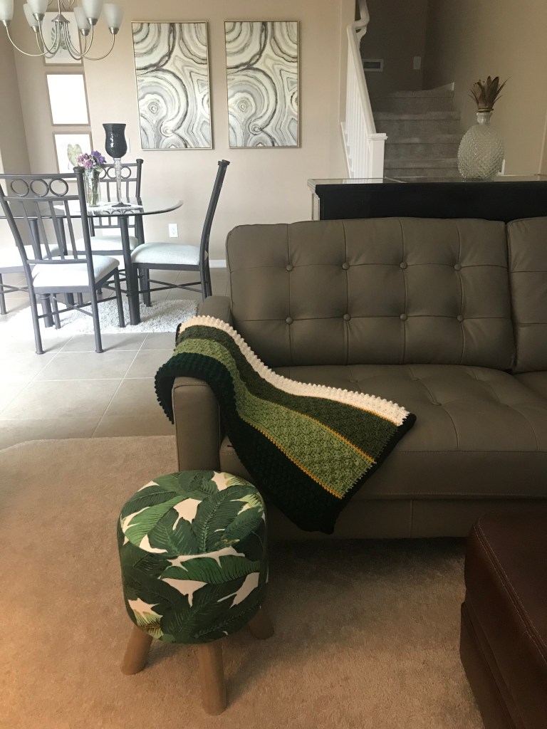
Green, which comes as a big surprise to me because green is my least favorite color behind pink. But I like it.

It could be that green complements the brown walls and cabinetry. Think tree trunks and leaves. It could be that the house has tons of natural light. Think sunshine and vegetation.

I could have gone with blue if I wanted to. The living room and master bedroom suites are grey and silver, both of which are cool colors. The blue would have fallen in line on the color palette.

But that’s just it. The silver, grey and blue do not provide a colorful range. Once I opened my mind to green, and saw the life it breathed into the decor, my love for the color grew like ivy. Now it’s the color I gravitate to.

Fortunately, the interior decor world is ruled by indoor trees, succulents and fig leaves.

Green is the perfect accent color in this sea of grey and silver. Photo by Cindy Hernandez

Putting metals to the mettle

Every home decor has a metal.

Gold. Silver. Nickel. Brass. Antique brass.

Some decors have a combination of metals. I used to think you had to be either/or. That was, until I started designing Goldilocks.

Because John and I wanted yellow for the exterior color, we kept with the warm color palette and chose brown for the interior walls. This made it easy to go with the standard sable-colored cabinetry. And when I think of yellow and brown, I think of gold metals.

But I had a growing collection of silver and grey furniture at my condo that I wasn’t about to part with. Plus, the kitchen appliances and vent hood were going to be stainless steel and the chandelier over the dining table, silver.

What to do?

How was I going to mix the cool effects of grey and silver with the warmth that exudes from yellow and brown?

Enter the monochromatic artwork we found for the dining room walls. The art pieces include gold, silver, grey, cream and black and help transition the warm color scheme in the kitchen into the cool color scheme in the adjoining living room.

I realize now that it would have been okay to mix the metals without the monochromatic pieces. But the artwork gave me the permission I felt I needed at the time to cross the color palette lines.

What metal is your house? Have you ever thought of metals in this way?

These monochromatic art pieces help mix the warm browns and cool greys throughout the main floor. Photo by Cindy Hernandez