Putting metals to the mettle

Every home decor has a metal.

Gold. Silver. Nickel. Brass. Antique brass.

Some decors have a combination of metals. I used to think you had to be either/or. That was, until I started designing Goldilocks.

Because John and I wanted yellow for the exterior color, we kept with the warm color palette and chose brown for the interior walls. This made it easy to go with the standard sable-colored cabinetry. And when I think of yellow and brown, I think of gold metals.

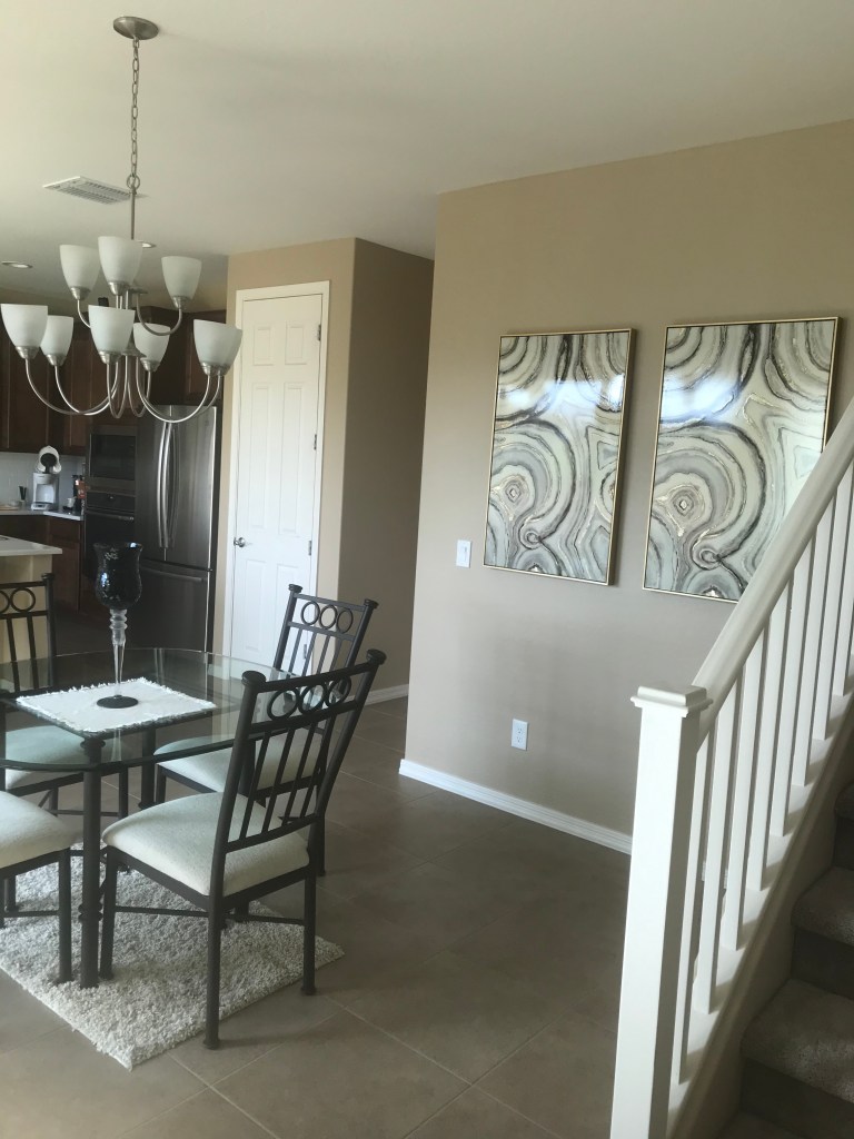
But I had a growing collection of silver and grey furniture at my condo that I wasn’t about to part with. Plus, the kitchen appliances and vent hood were going to be stainless steel and the chandelier over the dining table, silver.

What to do?

How was I going to mix the cool effects of grey and silver with the warmth that exudes from yellow and brown?

Enter the monochromatic artwork we found for the dining room walls. The art pieces include gold, silver, grey, cream and black and help transition the warm color scheme in the kitchen into the cool color scheme in the adjoining living room.

I realize now that it would have been okay to mix the metals without the monochromatic pieces. But the artwork gave me the permission I felt I needed at the time to cross the color palette lines.

What metal is your house? Have you ever thought of metals in this way?

These monochromatic art pieces help mix the warm browns and cool greys throughout the main floor. Photo by Cindy Hernandez

Artwork placement mistakes to avoid

One of the most common design mistakes I see is artwork that is too small for the space.

I once heard a photographer say when you have the shot just right, take one giant step toward your subject. NOW it is just right.

The same can be said about artwork. Just when you think you have the right size, go bigger. Even if it’s just a tad larger.

This might mean you have to go with a different piece. Or you have to shop around for a similar subject in the right size. It sometimes means you have to shop for the size, and then settle on the subject.

But trust me, it will make all the difference on your walls.

Artwork is supposed to stand out.

Artwork is supposed to make an impact. A statement.

It’s supposed to garner attention. Provoke thought. Stimulate conversation.

It can be a drawing, a painting, a family photo. Whatever.

Lord knows you paid a lot of it, so make it count. Fill the space as much as possible. There is nothing worse than having the blank space on the wall dwarf the piece of art you thought worthy of adorning your home.

If your artwork is small and you’re determined to use the piece, hang a collection of small pieces to create a larger display. If you do this, though, go with three pieces. Yes, three. Or five. Just as long as it’s an odd number.

The other mistake I see is placement that is too high on the wall. Your visitors should not feel like they are peering up at the Empire State Building. Artwork should be at eye-level. Who’s eye-level? I recommend the person in the house of average height.

Instead of extending your arms upward as you place the art against the wall, extend your arms outward. Not up and out. Just straight out.

Test this out. See if it works. If the size of your art was right from the start, you may just have a natural eye for this stuff.

This canvas of mason jars is perfectly placed at eye-level. Photo by Cindy Hernandez
Avoid the temptation to place artwork higher on the wall in order to fill the space. Instead, always shoot for eye-level. Photo by Cindy Hernandez